Branding: When your fans identify your brand, they primarily associate it with your logo. And their perception, in turn, is largely dependent on color. The right logo color can enhance (or negate) your product branding marketing strategy.
Color is part of the image branding
- Identify the branding (the brand must be associated with one color).
- Differentiate the brand from competitors.
- Identify the product category in which the company operates.
- Strengthen the emotional image of the brand.
As shown in a study by branding experts, an unconscious attitude towards a product among consumers is formed in the first 90 seconds of eye contact with it, and in 85% of cases, their judgment is based on color perception.
The logos used by successful companies span the entire spectrum of colors. However, the relationship between good color choices and color perception is very clear. Before choosing a color, we need to determine what we are choosing from.
To do this, you can simply go through 3 points:
- Exclude competitor colors.
- Exclude colors that seem inappropriate for the category.
- Eliminate colors based on personal preference.
Let us consider the study of color psychology in more detail – using the example of the main and most common colors of the spectrum: red, yellow and blue, as well as their derivatives, orange, yellow and purple.
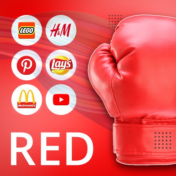
RED
Among all other colors, red evokes in a person, perhaps, the strongest associations, symbolizing at the same time love, blood, heat, danger, aggression, urgency and prohibition. It enhances all feelings, excites the nervous system and stimulates decisive action.
Influence on feelings
- Heats passion, feelings and emotions
- Attracts attention
- Increases blood pressure and heartbeat
- Color of anger
Role in marketing
- Stirs up an appetite and encourages action
- Provides a sense of urgency
- Used to stimulate impulse buying
Brands using red logos
McDonald’s, Lays, Lego, Pinterest, Heinz, YouTube, H&M, Nintendo, Virgin, Adobe, Coca-Cola, Toyota, Gmail and others.
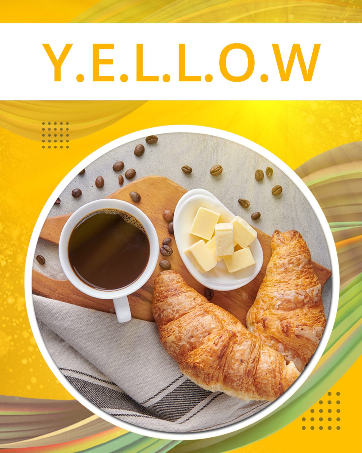
YELLOW
Yellow is the color of gold, sun, bread, butter and lemons. Represents wealth and prosperity, warmth and light, and, like red, stimulates the senses and awakens Symbolizes hope and optimism.
Influence on feelings
- Excites the nervous system
- Stimulates communication
- Excessive use strains eyesight and tires eyes
Role in marketing
- Promotes a sense of clarity and improves thought processes
- Brings joy and happiness
- Can make kids cry
Brands using the yellow logos
Nikon, National Geographic, Shell, Hertz, AOL, CAT, DHL, IKEA, IMDB and others.
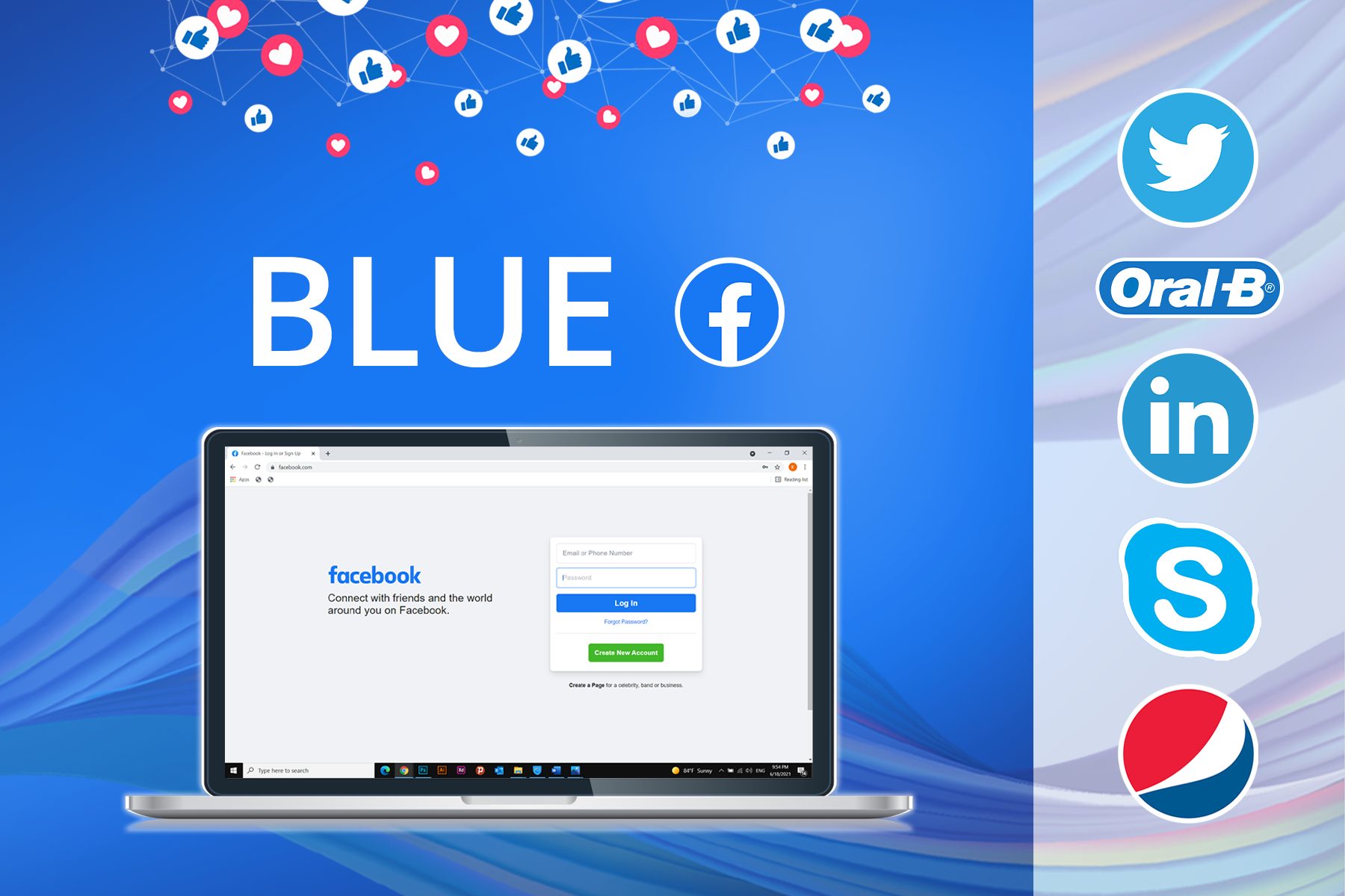
BLUE
The most suitable color for a business environment. It carries associations with the tranquillity and purity of water and air. Soothes the senses and lowers blood pressure. It inspires confidence, a sense of clarity and verification.
Influence on feelings
- Suppresses emotions and appetite
- Increases performance
- Associated with coolness and tranquillity
Role in marketing
- Preferred mainly by men
- Brings security and trust
- Most common in office culture
Brands using blue logos
Facebook, Twitter, LinkedIn, Pepsi, Oreo, Skype, Vimeo, Oral-B, Flickr, Microsoft Word, Ford, General Electric, DELL and others.
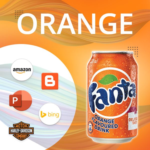
ORANGE
Situated in the spectrum between red and yellow, orange gets its name from the French word for “orange”, symbolizes warmth and excites the nervous system. Associated with vitality, abundance and balance.
Influence on feelings
- Provides a burst of energy and enthusiasm
- Warms and promotes trust
- Attracts attention
Role in marketing
- Used for strong, aggressive campaigns
- Encourages active action
- Creates an atmosphere of friendship, fun and trust
Brands using the orange- colored logos
Nickelodeon, Fanta, Amazon, Firefox, Blogger, Microsoft PowerPoint, Bing, Harley-Davidson and more.
GREEN
Green color brings freshness and coolness to foliage. For consumers, it is associated with nature, health and luck.
Influence on feelings
- Relaxes soothes and relieves stress
- Eases pain and depression
- Refreshes and renews
Role in marketing
- Associated with health and procreation
- symbolizes naturalness and environmental friendliness
- Means novelty, “young growth”
Brands using the green logos
Starbucks, Android, Microsoft Excel, Evernote, Whole Foods, Animal Planet, Spotify, Xbox, Land Rover, Holiday Inn and more.
VIOLET
In most cases, purple refers to calm and calming colors. In modern culture, it symbolizes spirituality, magic and royalty.
Influence on feelings
- Associated with success and wisdom
- Symbolizes power and arrogance
- Promotes hypnosis and charm
Role in marketing
- Used in products for children and seniors
- Provides calmness and balance
- Creates an atmosphere of creativity, wisdom and spirituality
Brands using the purple logos
Yahoo!, T-Mobile, Hallmark, Viber, Milka, Craigslist and more.
Conclusions: What is the most appropriate logo color?
There is no one correct color for your brand. Determine for yourself what values your product carries, what associations it should evoke in your customers, and what color will help you heighten the feelings you want and create a strong emotional connection. And the logos of large brands that spend colossal sums on such research will help you make sure you are right in your choice or need to determine another direction.

